Wednesday, July 1, 2009
Video
Aquatic Sublime
This video is made up of underwater footage I took of an installation I made. When I made the installation, I knew that I wanted to video what it looked like from underwater, but I didnt know how. I did attempt to edit a video together, but it was not very effective. This video flows a lot better and I made the colors stand out a lot more! One big thing that I discovered while making this video was how much I loved the audio. It sounds so scary to me and is such a contrast to the happy images of the colorful balloons. I enhanced this opposition by adding effects to the audio in order to make it a more substantial presence. I think it works out really well and I am much happier with this video. I would like to project it really large up on the ceiling so that the viewer can see how it looked to me while I filmed it.
Monday, June 29, 2009
Frame by frame photoshop animation
Watch Your Step!
This assignment was soooo time consuming! This one minute cartoon took me about 12 hours to make! It is just a silly little cartoon that made me giggle while I was making it. The little details of the eyes and emotions above his head make it soo much better. I got these ideas form being an avid cartoon watcher haha, and the sound effects make it sooo funny!!!
This assignment was soooo time consuming! This one minute cartoon took me about 12 hours to make! It is just a silly little cartoon that made me giggle while I was making it. The little details of the eyes and emotions above his head make it soo much better. I got these ideas form being an avid cartoon watcher haha, and the sound effects make it sooo funny!!!
Wednesday, June 24, 2009
POT HEAD Frame by Frame Animation
Here is my first animation!
This was so fun to make. Animation is a cool process and this was my very first attempt at it!
Monday, June 22, 2009


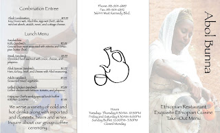
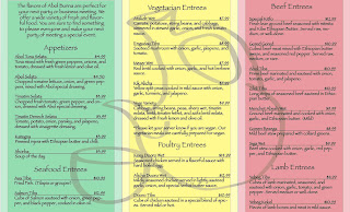
This assignment was sooo much work, but a great learning tool. The content was already available, and I got to transform the original menu into something that is more effective. The original menu was very hard to read and really busy. I tried to keep this one simple and easy to read, while still adding cultural elements of the restaurant. I also redesigned the logo.
Wednesday, June 17, 2009
My Business Cards
Monday, June 15, 2009
Poster
Sunday, June 14, 2009
Blackbird Calligram
Subscribe to:
Comments (Atom)


